Arabic calligraphy is not one style. It is a family of scripts developed over centuries, each with its own proportions, tools and purpose — and choosing between them is the single biggest decision in commissioning a piece.
Here is how to tell them apart, and what each is good for.
Kufic — the angular one
The oldest of the major scripts, named for the city of Kufa. Kufic is geometric and upright: straight verticals, flat horizontals, sharp angles and very little curve.
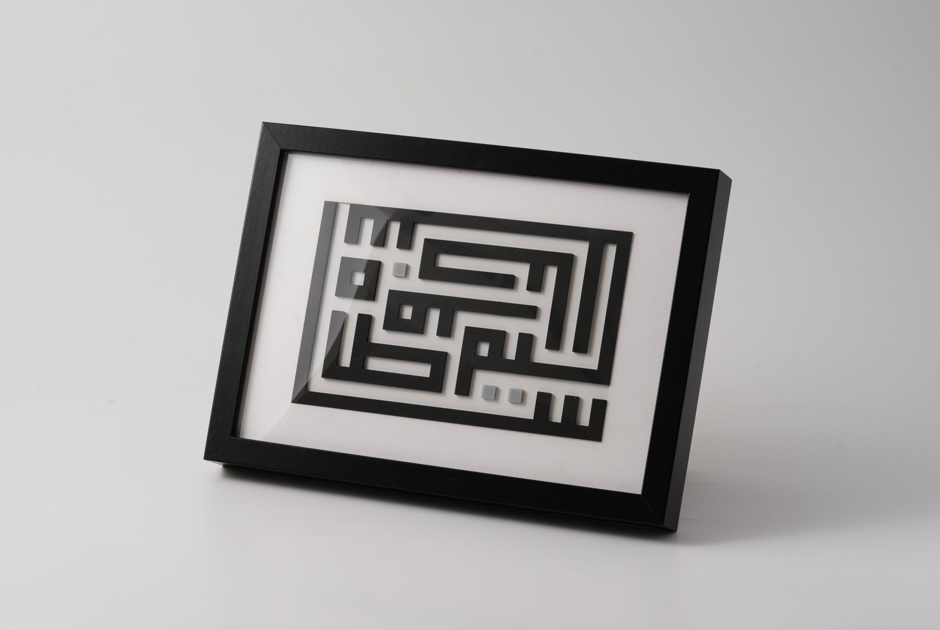
Its most striking modern form is square Kufic, where letters are compressed into a grid until the text becomes an interlocking pattern. It reads almost as architecture, which is fitting — it was used on buildings and coins long before paper.
Best for: contemporary interiors, logos, name pieces, anything where you want the text to also work as a graphic form. It is the easiest script to integrate into a modern room because its geometry sits naturally alongside straight-lined furniture.
Thuluth — the monumental one
Thuluth is the script of grandeur: tall, sweeping verticals, deep curves, and letters that overlap and stack into dense compositions. The name means a third, referring to its classical proportional rule.
It is difficult to execute well and unmistakable when it is. Thuluth is what you see on mosque walls and monumental inscriptions, and it is the script most often used for Quranic verse.
Best for: statement wall pieces where the calligraphy is the focal point. It needs space and scale — Thuluth compressed into a small frame loses the sweep that makes it Thuluth.
Naskh — the readable one
Naskh is the workhorse. Clear, rounded, evenly proportioned, designed for copying text at length — most printed Arabic, and most of the Quran in print, is set in Naskh or a derivative.
It is legible above all, which makes it less dramatic than Thuluth but far easier to read at a glance.
Best for: longer phrases, verses meant to be read rather than admired, and pieces where clarity matters more than flourish.
Diwani — the flowing one
Developed in the Ottoman chancery, Diwani is cursive, dense and highly decorative. Letters ride an ascending baseline and lock together in tight, flowing arrangements. Diwani Jali adds ornamental dots and marks filling the spaces between letters until the composition becomes almost solid.
It was originally a court script — partly for beauty, partly because its density made documents hard to forge or alter.
Best for: ornate, luxurious pieces, and short phrases or single names where the interlocking flow can be appreciated. It is the most decorative of the classical scripts.
Ruq'ah — the everyday one
Simple, compact, quick to write, with short strokes and letters sitting close together. Ruq'ah is the everyday handwriting of much of the Arab world.
It is rarely used for formal décor precisely because it is informal — but that plainness can be exactly right for something meant to feel personal rather than ceremonial.
Best for: casual, contemporary pieces; anything that should feel handwritten rather than inscribed.
Choosing for a piece
A few practical rules:
- Short text, lots of impact → Diwani or Thuluth
- Long text meant to be read → Naskh
- Modern room, geometric furniture → Kufic, especially square Kufic
- A name for a new home → square Kufic reads as design; Diwani reads as heritage
- Quranic verse → traditionally Thuluth or Naskh
Also consider the size. Thuluth and Diwani need room to breathe; their character lives in sweeping strokes and dense interlocking, both of which disappear when scaled down. Kufic survives small far better.
Why script choice matters more than colour
People commissioning calligraphy often start with colour and size. Script is the more consequential choice: it determines whether the piece reads as ancient or contemporary, formal or personal, monumental or quiet — and it does so before anyone has read a word.
Get the script right and a plain black-on-ivory piece will carry the room. Get it wrong and no palette will rescue it.
We work across all five scripts, made to order in Dubai with fully hand-finished edges. If you know the phrase but not the script, send it to us with a photo of where it is going — the room usually answers the question.
Want to try these scripts yourself? Read the history in our free calligraphy essays or open Mashq Studio and compose your own piece — every script above is in it.